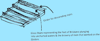
Week 4 Communication

In this week I  worked on more communication ideas.

We looked at our Concept of framing the views and creating prominence. So I drew some diagrams to try and convey some of these aspects. The following diagram below showed how with selective framing, blind spots (Red/grey) were created which made the object being framed appear to 'float' and it enabled to viewer to disregard a lot of the detail. How idea was about disregarding and appreciating only certain elements.


This is a diagram showing the Context by Harcourt Street and how obscure the folie could potentially be as well as how difficult it would be to frame views from a less elevated position. This location was easily accessible it was easier to frame the bridge and people could not miss it. 


I also drew some diagrams that intended to depict the Experience beyond 2 dimensions. Here you can see the transparency of the glass opening and floor - a lot of information is discounted and a lot of information is also revealed. 

I looked at how the structural forces and the Tectonics  and how the folie was in fact going to respond to some of these forces and this was important because I felt that there should be an holistic informing of the folie not just superficially in terms of materials etc but also in the way the folie worked. So the folie was in essence going to draw some inspiration from the Story Bridge. This was not to say it covered a lot of areas, but in some  ways it represented some of the aspects.

So this diagram for example shows the gravitational forces and the load forces being directed to the anchor points. It shows how the loads create tension that is counterbalanced by compression from the anchor points. This is a very basic idea of our a anchored cantilever bridge or design works.

I further explained this concept with this diagram. (At the same time when I was developing these ideas I was collaborating with Jayne who was modelling the folie in Revit and it helped to progress the ideas).

This diagram shows the load being applied, tension being created on the upper surface, compression being forced on the lower surface through deflection and counterbalance enacting.

I also worked backwards and showed how we had developed our ideas from the context of the site.

This diagram shows how the form was dictated by influences from the story bridge such as the shape of the arches/K braces etc, the revits and the richness of its history. So layering was essentially the process that created our folie.

Following all this work in communicating our ideas. I started working again on the posters layout and this was how it looked ultimately. Jayne sent me through some of the finalized images in revit...and I layered images of the Story Bridge through the images as shown here.

This image corresponds with the stages of construction of the Story Bridge and by layering the images of the Story Bridge on the 3D model that Jayne created - I made this evident.

I worked with Jayne in creating the layout of the posters. I structured the narrative in a vertical axis so it was easier to read. I created the first page for the context and the depiction of the folie through the hero image.  The second poster was for the concept and process and the last poster was for the structure. I labelled a lot of the structure to make apparent our choice of materials. The materials were really influenced by the functionality but also reference to the site, context etc i.e. use of steel framing.

1st Poster

2nd Poster

3rd Poster

Week 3 Lecture Reflection/Communication

The lecture really stressed the importance of communication and relating this process back to the folie concept

It was stressed that overwhelming posters were not desirable and something more easily interpreted was the better option.

So I went on indesign and created a background of medium intensity and I carved out views within the background which represented the framing concept of our folie and the concept of focusing on what is important.

Josh at the same time had taken some pictures of trusses and I incorporated this into the poster. The outer layer was dark, but I felt the voids maintained the easy interpretation. So I came up with this design.

There was however still this idea floating around in the group about making the poster even more efficient and easy to interpret. So the idea was to make the background recede and neutral in line with out Concept (Much the same way as the interior of the folie) and make the content stand out (like the framing in the story bridge).

This layout some of us felt was easier on the eyes and was something that I designed with more efficiency and structure. 

I also started sourcing some images that would communicate our ideas and I played around with this image to focus on the skilled worker and also other images of the site. This idea of the historical significance was the Context.

http://bishop.slq.qld.gov.au/R/MERSP33LX9Y4CK1MX5SQEIJ7DPXJMNT6TC95IHUB9VKC5V1697-00012 
Diagramming was something that I concentrated on afterwards and this was to try and communicate the Experience within the space/site.

The map was the first graphic I created and it aimed to show the distinction between the various zones next to the site and the importance of these areas to the folie - the idea was to express the youthfulness of the site and how the experience within the folie would engage with the younger generation.


This was another diagram I worked on this week which communicated how the Tectonics would help guide the visitor. Essentially the entry point was going to run across the face of the folie - directing the visitors across the journey that we were trying to express. This was something I felt was crucial. Directing people in terms of materials, entry points, views. This was something in great contrast to my earlier ideas from the Semester which were more opaque.

I planned to work on other ideas/concepts and diagramming in the following week. Diagramming essentially was something I used not simply to convey the messages across but also as part of the design process. 

Week 3 Continuing Concept Development

At the same time that I was developing my ideas, other members of the group were concurrently developing some ideas with regards to the form and tectonics. Some of us thought that something immobile was possibly the best way to go about the folie design.

The reason why we endorsed the idea of an immobile structure was because:


We wanted to give people the initiative rather than simply containing them in the folie.


We were mostly thinking along the same lines with a form that responded to the story bridge, its shape, materials etc. Once again I was inspired by some photographs I came across (This time of the Howard Smith Wharves)

So I drew up a revised sketch of an immobile structure (That utilized materials from the site) The framing of the story bridge however at this stage was not resolved. I just investigated some structural ideas.


Here I thought the structure should be partially cantilevered

The direction that the group agreed upon though was more a steel based design as opposed to the timber

The first concept the group pushed was this steel based structure. Quite triangular/diagonal. This design was actualised by Josh and it resolved how we would frame the views. The external shutters shown here would restrict the views to portions of the bridge only. Each portion would represent a different stage of construction of the bridge.


In the group, some of us felt however that the following design above was unresolved and was almost detracting from the bridge by placing too much emphasis on the K bracing etc

This design was resolved in terms of assemblage, it was clear and the structural composition was efficient. Flooring system composed of joists/bearers based off the concept that I proposed. I felt that the facade should communicate the economics significance of the bridge also - so it should be richer - hence the detailing/materials etc. 

Neutral colours on the interior so the visitor is not distracted from the bridge and the more rich external face to signify opportunity/wealth. 

Week 3 Concept Re-evaluation

After consulting with Ruwan, it dawned upon me that my initial ideas/concepts were not finalized to the point where the intended messages could be easily conveyed. The learning experience was left to be interpreted by the audience.

Myself and others in the group decided  to simplify the concept of framing into something more straight forward and direct. We thought about framing the city. Historical events within the city's construction such as the construction process of specific buildings or a series of buildings was considered. However we decided to look closer to the site, much closer. The story bridge was not only partially within the site, but it had a very prominent place in Australian engineering history.

Immediately we revisited some of the concepts that we initially thought of previously, such as vertical/horizontal axis movement to pan the scene. I decided that an horizontally moving mechanism external to the folie would be suitable.

The arch would ensure that the views would be quite segmented, facing away from each other and panning efficiently across the scene.

However I considered 2 things.

1) The Story Bridge as prominent as it is, has little impact on the Brisbane River
2) We could not justify having this extensive addition of a track system etc if we could achieve it another way.

I started drawing up some abstractions derived from the Story Bridge.

Form Derived from Story Bridge
I thought of a form that would incrementally increase in size and I came up with the idea of beams of some sort that would run across the surface of flooring after browsing through a construction photo of the Story Bridge. This would try to recreate the feeling of working on the sites during construction


I incorporated some of these basic elements that I thought of into a very tensile structure. Unlike my previous idea from Week 2 which was in engineering terms a 'tent' I wanted to create something more holistic. So the folie was just going to be structure and continuous. So I started drawing up these tensile members that would hold up the structure to provide the views. The Main Column or columns in this design are revolving to pan the views.


This structure would be quite efficient as it would have little weight drawing down the gravitational forces, it would be fluid. It would be cantilevered overlooking the cliff (Height would accentuate the views) It responds to the context of the story bridge through the steel members, the form

Week 2 Howard Smith Wharves - Folie (Entry Six)

My Concept were the cuboid forms that could reflect light and the environment etc - so the folie would be dynamic. Affected by seasonal variation and contextually grounded. These cuboid forms would also create the framing.

I designed the first option as such and with the later options, I experimented with the forms a little bit.
Folie Design Option 1 (Left) & Option 2 (Right)
Folie Design Option 3

..............I think Option 1&3 would best convey the intended message of a very evocative and contrasting vantage point. Option 2 is more uniform.

Later on, I took the design a little further on and thought about the context and how to contrast the key concepts of 'monumental' architecture and 'fragmented' architecture.

I separated the folie into two halves. One half was at human scale - 2.4 metres high, the other half represented the monument and was 2 metres high. The monument segment was inhabitable, you could only see it. It was to be seen from a distance and from within the structure but nothing else could be done with it.

Context
 The actual space (below) was fragmented with the same cuboid forms from my original sketch - these would reflect light and the environment. They would create  frames and reduce the monuments into something fragmented and localized.  

One end of the space would not be fragmented (below) - this would represent the open and direct view of 'monument' architecture. You could see the cliffs openly  and it would represent the Experience imposing/powerful and isolated monument architecture is.

 When in the space - you could look up at the sculptural hemisphere above - it would be imposing - uncomfortable to look at and it was unreachable - much like the Experience monument architecture.

By creating these two conditions within the folie (externally/internally) I hoped that the Function of the folie would be for people to Experience something that informed them and something that they could learn from visually. It might not be as strong and obvious - but it could perhaps be suggestive.

In terms of Tectonics, I thought of having tension chords to uphold these cuboid forms as well as the hemisphere above the roof. The roof of the structure would be upheld by columns in compression. 

Hemisphere is bolted centrally to roofing and fixed on its four 'corners' with anchored cables. 


Section showing I beam fixed to concrete columns and metal cables upholding the cuboid forms. The plan shows the columns in the corners and rigid bracing to allow for a unobstructed architectural experience.

Week 2 Howard Smith Wharves (Self - Natural/Artificial) (Entry Five)

I decided that the concepts I was really interested in was not primarily the axis but rather the concept of natural/artificial (physical) and how this is perceived (self).

I settled on the idea, that both natural and artificial were simply conditions that people had to contend with and how we perceive them was simply determined by how we can relate to them. I also decided that you cannot compare or separate the axis and it was a combination of all three axis that gives presence.

Certain architects in history associated modernity with this idea of conquering nature - Le Corbusier said architecture was victory over nature (DAB 525 Mirko -Lecture). I decided that even the built environment needs to be conquered, altered etc and therefore even what we create is not definite but also a condition that can be likened to nature. Therefore I coupled the two terms nature/artificial into a singular concept of physical.

I drew up this following chart...exploring these concepts.


Continuing my train of thought, I decided that since the modern world was also an environment that needed to be conquered etc, then maybe by giving architecture or design - free form then people begin to articulate the physical presence of cities etc in their own way.

I drew some sketches which I thought could represent folies - ways in which people could see the city in a different way and learn new ways of seeing the city  and since this condition already exists it could reinforce ideas that they already had. Learning is not simply a way of being introduced to something, it is also a way of retaining memory.


Giving people a view or a frame of something - gives that location a unique vantage point and therefore gives a person a retention of that view and of that memory even without suggesting anything else, that alone is learning. Leaning: 2. To fix in the mind or memory; memorize

But I wanted to take it further. I thought of my concept and I stated that the environment/surroundings reflect or reveal architecture/buildings because that is the way that we truly understand most buildings in the world. Not in isolation, not as monuments but as contextually grounded and in relation to other places i.e. The Riparian Plaza by Eagle Street which you see framed by Edward Street/Charlotte Street intersection.

I  also thought of it metaphorically. I thought of the idea of reflecting the surroundings on shards or an organic form that would reflect these images arbitrarily to create a very strong emphasis of the environments presence. Organic - not because it would have no specific intent but to communicate the idea of how architecture is understood within context and authentically. Devoid of the forceful elements that force and direct people such as axis, channels, grand imposition etc. This was simply another way to see architecture. Axis is quite functional, monuments are great etc....but representing the ways in which people understand architecture was a learning experience. To represent this - I was going to attempt to achieve this with contrast - Which I will depict in the next entry. 

Week 2 Lecture - Folie Exploration (Entry Two)

I begun thinking of folies in architectural terms - not so much in a universal way, but specifically in terms of the architectural experience.

I looked at the Kazimir Space Model.


For me this was a space that seemed to blur the concept of solid and void. One could question the meaning of  solid and void. Is void something habitable or is it a visual element. As the visitors move through the space - their perceptions are constantly altered in relation to the illusion of solid and void. For me this was a folie, because it questioned their perception and consequently they learned a new way to perceive space and understand it. 

Continuing on from the concept of solid and void and the spatial implications - I looked at Light & Dark.
This example was not an architectural design with intent - but it did express the idea clearly. Something that is solid implies limits - something with void implies that it is a container of sorts. With darkness the limits are not known. I felt this was something that architecturally speaking could reinvent spatial perceptions and people could learn about the ways that they experience space.

Dark Room


Week 2 Lecture & Howard Smith Wharves (Entry One)

In the lecture the folie was described as a space that could be experienced - a place that was not a destination but rather an experience - an intermediary space and a learning space.

The folie had some restrictions, it needed to be confined within a 5x5x5 cube and it needed to accommodate 2 people. Important points  to register - was the need for the folie to be contextually grounded, the importance of how the folie would be seen from a distance and in close proximity. The folie had to be something that was informing and habitable - beyond something that was merely sculptural. It should be variable and site relevant - affected by seasonal changes. How the folie would be assembled was also critical.

The Walkshop which I completed for DAB525 helped inform some of the ways that I would address these design problems.

Vegetation juxtaposed with Story Bridge in the Background


Black & White Image showing the Underside of the Bridge(Structural trusses and piers), the Brisbane River and Riverside buildings.


The Black & White image helps to show the visual relationship between the elements and how they appear in context. The pier of the bridge seems to float above the river - the underside of the bridge is essentially a roof above the river and the high rise residential/commercial towers are objects along the path of the river. Colour Shape, location seem to be critical aspects of contextual relevance. 

Riverside Sketch showing the Trustee House on the left, the modern Rio Tinto Brisbane office on the right and St John's Cathedral in the centre. 


Framing architecture is perhaps a way to localize architecture and create unique contexts - even if there is a sharp contrast that exists - such as in this case - with the modern buildings and the heritage building.

Week 2 Howard Smith Wharves (Reducing Scale/Perception) (Entry Four)

Following on from my train of thought, I began sketching and theorizing about ways to reduce scale and limit its presence. I identified framing, because it focuses on specific areas of the natural or artificial environment and it thus reduces its overall presence.

Framing
I also identified distance; because due to optics - objects will appear smaller over distance.

Transparency/Distance 
This concept of imposition, I felt could be challenged by using artificial (created) elements to tame natural (existing) elements or vice versa. I felt that true design had to be entirely mindful of the bigger picture. So if something had no context - it was almost anti-design - in the sense that it did not attempt to factor in people or certain people. So I changed the theme from 'Axis' to 'Natural/Artificial'.

Week 2 Howard Smith Wharves (Axis) (Entry Three)

When I did my architecture walkshop, I noticed the existence of views around the riverside that framed the city in a very informal manner, as opposed to the views that you  would see if you walked through the city grid.

Riverside Sketch


City Grid (Formal)


I translated this idea of the city grid and of the imposing developments in CBD into the concept of 'SCALE' and 'AXIS'


I identified the x axis (The wide vantage point) and y (The deep vantage point) as that of human scale and the y axis (The high axis) as that of imposition and isolation. I felt that one of the ways in which these monumental structures become integrated into the city properly and within the realm of human scale was through framing and segmentation. Breaking down the architecture into a holistic piece rather than individual and dominant pieces of architecture.

In Urban Design, even a channeled path (In this case - the Brisbane Riverside) is considered Axial movement. So essentially the Brisbane City center is primarily centered around formal axis. Axial movement is determined by a line that directs movement.

Brisbane Riverside (Axial movement)